How to Choose a Color Palette for Your Home

Choosing a color palette is one of the most important decisions you will make when decorating your home. The right colors set the mood, tie rooms together, and reflect your personal style. A well-chosen palette makes your home feel cohesive and intentional, while a mismatched one can leave even the most expensive furniture looking out of place. The good news is that you do not need to be a trained interior designer to create a beautiful color scheme. Here is how to build a cohesive palette you will love, step by step.
Key Takeaways
- Start with an inspiration piece — art, rug, or photo — and pull 3-5 colors from it
- Use the 60-30-10 rule: 60% dominant neutral, 30% secondary, 10% accent
- Test paint samples on your walls at different times of day before committing
- Create flow between rooms using a consistent neutral with shifting accent colors
Start with Inspiration
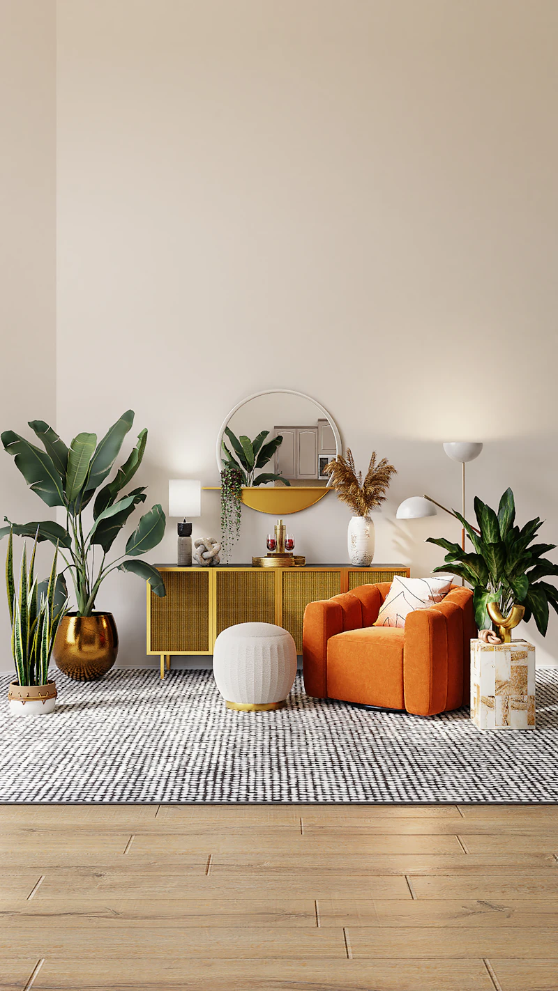
Look for a starting point — a piece of art, a rug, a fabric, or even a photo of a landscape you love. Pull colors from that source. Most great palettes have 3-5 colors: a dominant neutral, one or two secondary colors, and an accent. Your inspiration piece acts as a built-in guarantee that the colors work together because they already exist harmoniously in one place.
If you are drawing from nature, consider what draws you to a particular scene. Is it the soft blue-gray of a morning sky, the warm terracotta of desert rock, or the deep greens of a forest canopy? Nature provides endless, foolproof palettes that feel balanced and organic. Similarly, a favorite fabric pattern or a vintage rug can serve as your palette anchor. Hold your swatches or paint chips up against the inspiration piece to confirm they relate before committing.
Save images on Pinterest or create a physical mood board with paint chips, fabric samples, and magazine clippings. Live with your board for a few days to see if the combination still appeals to you. This process helps you avoid trendy colors that you might tire of quickly and steers you toward a palette with staying power.
Understand Color Theory Basics

Colors on opposite sides of the color wheel (complementary) create contrast and energy. Think navy and mustard yellow, or sage green and blush pink. These pairings feel dynamic and are great for spaces where you want conversation and activity, like a living room or dining area. Analogous colors (next to each other, such as blue, blue-green, and green) are harmonious and calming — ideal for bedrooms and reading nooks.
Neutral-based palettes with one pop of color are beginner-friendly and timeless. A room that is 80% warm white, beige, and taupe with a single accent color in the pillows and art feels grounded but not boring. The accent color draws the eye and creates focal points without demanding constant attention.
Warm colors (reds, oranges, yellows) advance visually, meaning they make a wall feel closer. Use them in large, well-lit rooms or on an accent wall you want to emphasize. Cool colors (blues, greens, purples) recede, making a wall feel farther away — perfect for small rooms you want to appear larger. Understanding this simple principle will help you choose colors that shape the perception of your space, not just its appearance.
The 60-30-10 Rule

Designers often use the 60-30-10 rule: 60% of the room is your dominant color (walls, large furniture), 30% is a secondary color (upholstery, curtains, area rug), and 10% is an accent (pillows, art, accessories). This creates balance and visual interest without any single color overwhelming the others.
To apply this rule in practice, start by identifying your 60% color first. This is usually a neutral that you will use on the walls and your largest furniture piece. In a living room, that might be a warm off-white on the walls and a beige sofa. Your 30% color could come in as a blue area rug and matching curtains. The 10% accent might be a set of burnt-orange throw pillows and a ceramic vase that picks up the same tone.
The beauty of the 60-30-10 rule is its flexibility. You can swap the roles depending on your room. In a small powder room, you might reverse it: 60% a bold wallpaper, 30% a white vanity, and 10% a gold mirror and hardware. The rule is a guideline, not a prison — it simply ensures that no color fights for attention and that the eye has a clear path through the space.
"Colors on opposite sides of the color wheel create contrast and energy — think navy and mustard yellow, or sage green and blush pink."
— Color Theory Principle
Consider Natural Light

North-facing rooms get cool, grayish light, so warm tones (beige, terracotta, soft yellow, warm pink) help balance them and keep the room from feeling cold or sterile. South-facing rooms have warm, abundant golden light and can handle cooler tones like blue, gray, and sage green. East-facing rooms are warm in the morning and cooler in the afternoon — neutral shades with moderate undertones work well. West-facing rooms are cool in the morning and bathed in warm amber light in the evening, so colors with warm undertones like peach or cream will look consistent throughout the day.
Test paint samples on your walls and observe them at different times of day before committing. Paint a swatch at least 12 by 12 inches on each wall you plan to paint, and look at it in morning, midday, and evening light. A color that looks perfect at noon can appear drab or icy under evening lamps. Hold large color swatches next to your flooring and countertops to see how undertones interact. A beige with pink undertones might clash with a warm oak floor, while a beige with yellow undertones would harmonize perfectly.
Do not forget artificial lighting. Warm white bulbs (2700K to 3000K) enhance warm paint colors and make cool colors look softer. Cool white bulbs (3500K to 4100K) are better for task-oriented spaces like home offices but can make warm colors look muddy. Daylight bulbs (5000K+) render colors most accurately but can feel harsh in living spaces. Choose your lighting temperature before finalizing your paint color so you can evaluate them together.
Smart furniture choices and layout tricks for compact spaces.
Create Flow Between Rooms

Your home's color palette should feel cohesive from room to room. Use a consistent neutral throughout the main living areas, then introduce different accent colors in each space. Open floor plans benefit from a unified palette with subtle shifts. For example, if your living room uses a warm white with navy and brass accents, your adjacent dining area could use the same warm white walls with sage green and brass accents. The shared neutral ties the spaces together while the accent color shift defines each zone.
In homes with more defined rooms, you can be bolder. A hallway in a soft gray can act as a neutral bridge between a blue living room and a yellow kitchen. Carry the hallway color into each room as a trim or ceiling color to create visual continuity. Another designer trick: paint all your doors and trim the same color throughout the house. A consistent white or off-white trim creates a visual thread that connects every room, even if the wall colors vary widely.
Think of your home's palette as a story. The entryway sets the tone, the living areas develop the theme, and the bedrooms and baths offer variations on that theme. You want each chapter to feel related but distinct, not identical. A cardinal rule: avoid using more than five colors across your entire home, including neutrals. Fewer colors mean a more sophisticated, pulled-together result.
The Psychology of Color

Colors do more than look good — they affect how you feel in a space. Blue is known to lower heart rate and blood pressure, making it ideal for bedrooms and bathrooms. Green reduces anxiety and is associated with nature and renewal; it works beautifully in home offices, living rooms, and sunrooms. Yellow stimulates creativity and happiness but should be used sparingly — too much bright yellow can cause irritability. Soft butter yellows are more forgiving than high-saturation lemon yellows for wall applications.
Red is energizing and increases appetite, which is why it appears frequently in dining rooms. However, in a bedroom or living room, red can feel aggressive. If you love red, use it as a 10% accent rather than a wall color. Purple, especially lavender and lilac, is calming and slightly luxurious, suited for bedrooms and meditation spaces. Deep purple like eggplant adds drama to dining rooms or powder rooms when used on an accent wall.
Neutrals have psychology too. White feels clean and fresh but can be sterile without texture or warm accents. Beige and greige (gray-beige) feel grounded and safe. Charcoal and black add sophistication and weight — use them on lower walls, built-ins, or front doors for a bold statement. When building your palette, ask yourself how you want each room to feel before you decide what colors to use. Function should drive color choice, not the other way around.
Popular Color Palettes

Warm Neutrals: Cream, beige, taupe, warm white, and terracotta. Creates a cozy, inviting atmosphere that works beautifully with natural materials like wood, jute, and stone. This palette is especially effective in living rooms and bedrooms where comfort is the priority. Layer in textured linens, wool throws, and rattan to prevent the neutrals from falling flat.
Cool & Calm: Soft blue, sage green, gray, and white. Perfect for bedrooms and bathrooms where relaxation is the goal. This palette pairs well with white marble, chrome fixtures, and light wood floors. Introduce warmth through wooden accessories, beige textiles, or brass hardware to keep the palette from feeling cold.
Bold & Dramatic: Navy, emerald, charcoal, and gold accents. Adds sophistication to dining rooms, home offices, and entryways. Dark walls in a bold palette make a room feel intimate and luxurious rather than small. Balance dark walls with plenty of metallic accents, mirrors, and light-colored furniture to maintain contrast and prevent the room from feeling like a cave.
Earthy & Organic: Olive green, rust, clay, warm brown, and cream. Inspired by nature, this palette feels grounded and timeless. It works in any room and pairs beautifully with houseplants, unpolished wood, and handmade ceramics. This is one of the easiest palettes to execute because nature provides perfect combinations that are hard to get wrong.
Testing Before You Commit

Never buy gallons of paint based on a 2-inch chip from the store. Paint chips are printed, not mixed, and they look completely different at full scale on your wall. Instead, buy sample pots and paint large swatches directly on your drywall — not on poster board, which reflects light differently. Paint at least two coats and let them dry fully before evaluating, as wet paint looks significantly different from dry paint.
Live with the samples for at least three days. Look at them in the morning, at noon, at sunset, and under your artificial lights at night. Check how the color interacts with your flooring, furniture, and countertops. A color that works beautifully with white trim might look jarring next to honey-oak baseboards. Hold your fabric swatches, rug samples, and furniture photos right next to the painted area to see the full composition.
If you are choosing between two similar shades, lean toward the lighter one. Light colors are more forgiving of imperfect walls and changing light conditions. Dark colors magnify every imperfection in your drywall and require more careful prep work. Once you have tested thoroughly and feel confident, buy your paint and proceed. Rushing this step is the single biggest mistake homeowners make in selecting a color palette.
Final Tips

Don't rush. Live with samples before committing. Use color in layers — paint, textiles, and accessories. And remember: there are no strict rules. The best palette is one that makes you happy every time you walk through the door. Your home should reflect your personality, not a trend from a magazine. Start with one room, get comfortable with your choices, and expand your palette gradually across the rest of your home. A thoughtful, tested color scheme will serve you for years and make every other decorating decision easier.